
Bringing A Startup To Life
Bourn Creative helped turn a startup into an unmistakable brand that could compete with established players and scale across products, audiences, and channels. See what’s possible when strategy, messaging, design, marketing, content, and sales all work together to build one powerful brand.
Motivations AI hired Bourn Creative when the startup was barely a month old. Four years later, the brand has expanded from one primary product to an ecosystem of offers, website traffic increases month over month, thousands of leads have entered the pipeline through engagement systems, and outbound efforts have connected team members directly with targeted leads.
Through purposefully differentiated, cohesive branding applied consistently across every channel, this young startup earned the credibility of a much more mature company and competed in an already saturated market, stood out from market leaders, and won attention.
After the initial engagement to define and create the brand, Bourn Creative continued working directly with the CEO and collaborating with the entire team — freeing them up to chase bigger goalposts. She owned the brand across strategy, identity, product, websites, copywriting, marketing, content, sales enablement, events, training, demand generation, social media, and more.
Standing Apart In A Saturated Market
The assessment category was already crowded with established companies selling personality, strengths, behavioral, workplace, and leadership assessments. Many had significant market share and decades of name recognition. A new company could disappear into all that sameness pretty quickly.
After purchasing existing assessment intellectual property and multiple separate companies, each with their own markets, products, and brands, Motivations AI was formed as the parent brand. The plan was to create the Motivations AI brand and rebrand the core corporate product offering, Motivation Code, slowly bring the other brands into alignment, and finally rebrand them to bring them under the Motivation Code name.
The immediate challenge was differentiation — finding the gaps and creating a distinct, flexible brand system — and research informed every branding decision.
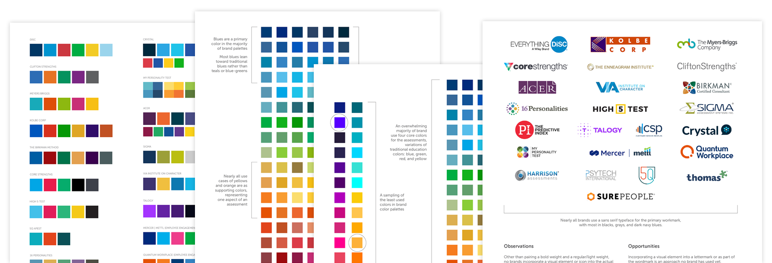
All existing assessment brands that could be found were studied. We documented each brand’s voice, logo, typography, color palette, photography, imagery, and overall visual approach, looking for consistencies and patterns across the category, and identifying the gaps where Motivations AI and Motivation Code could separate itself by doing something different.
Doing The Opposite And Creating Contrast
We learned what customers were trained to expect, where competitive alternatives looked and sounded alike, and where this new brand had room to become unmistakably different. Every brand design choice was backed by market research and evidence.
- While most assessment brands are very corporate and fully centered on the workplace, we anchored on the notion that serious business can still be fun, full of life, and packed with energy. That strategic idea led to the brand promise and tagline “Life at its best.” My job was to bake that promise into the brand — confident, energized, connected, engaged, and full of possibility.
- Most competitors communicate in a bland, corporate voice centered on data, definitions, and details. I took the brand in another direction, with a casual, approachable, friendly, candidly honest, and human brand voice that remains firm, professional, grounded, and credible.
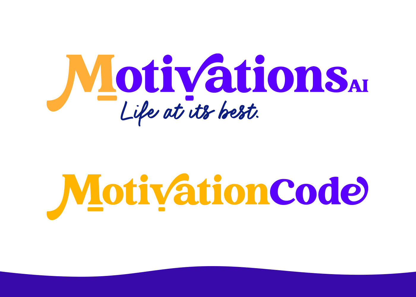
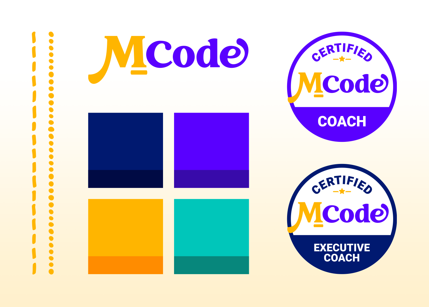
- Nearly every assessment company used an icon paired with the business name. We developed a wordmark instead, focusing on typography and giving the letterforms enough personality to carry the identity on their own. That decision also kept the brand’s identity from becoming unnecessarily complicated.
- Where much of the category’s visual design feels rigid and masculine, with straight lines and hard geometry, we chose curves, waves, rounded corners, circles, and softer organic forms.
- Primary colors, dark colors, and predictable mid-range corporate palettes featuring a lot of blue dominate the category. Yellow, purple, and aqua were the least used, most uncommon colors. Bright, highly saturated palettes were even harder to find, so that’s where we leaned in. The Motivation Code color palette became bright, vibrant, energetic, colorful, and full of life, and to created flexibility, balanced with darker shades of it’s core brand colors.
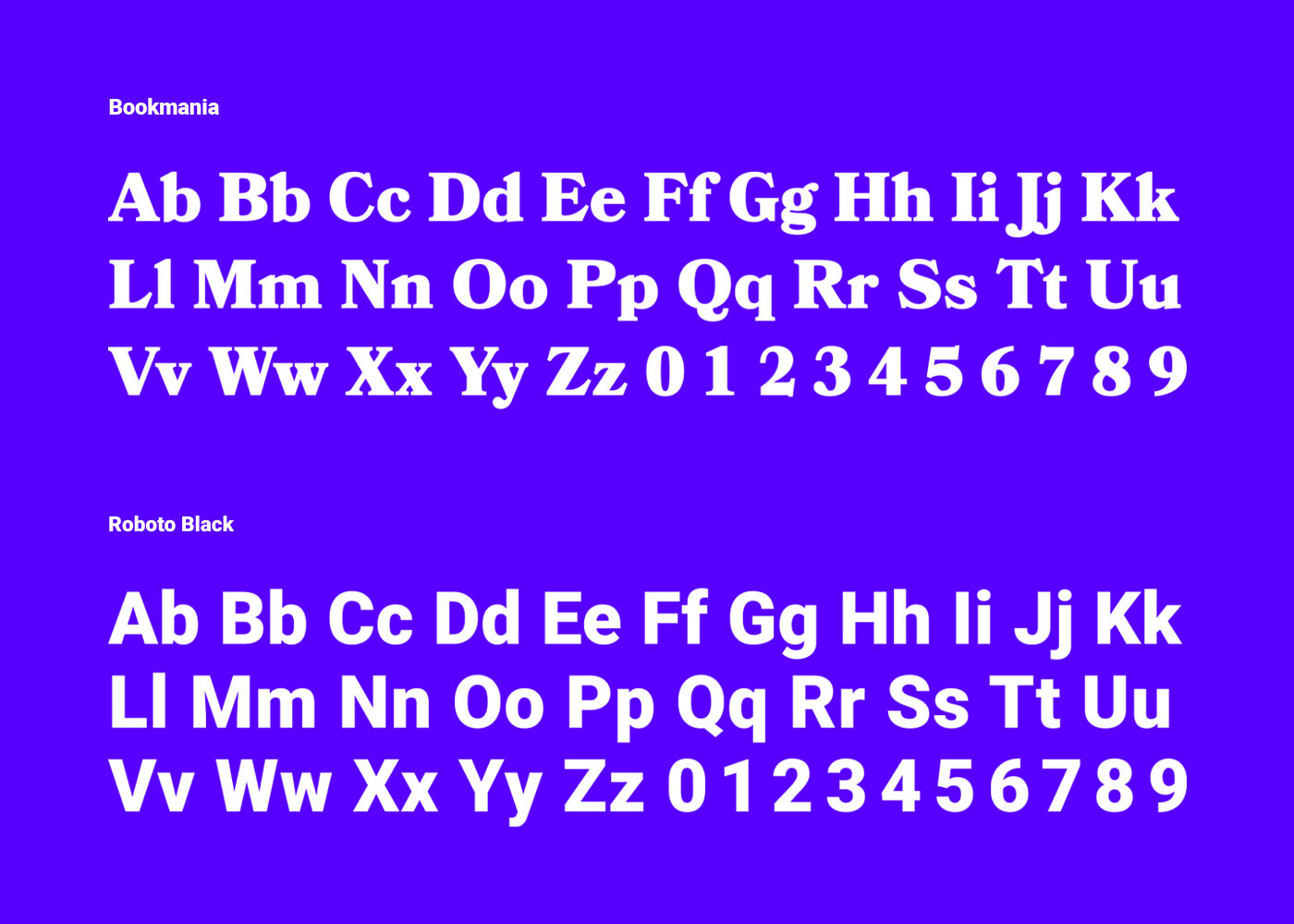
- Most typography skewed heavily toward highly traditional serif and sans serif typefaces, so we paired an expressive serif typeface with big curves and personality with a clean, traditional sans serif for balance, then introduced a handwritten script as an accent.
- The category most often skews heavily toward white men in both representation and leadership imagery, as well as corporate, suited, and very obvious posed stock imagery. Our photography strategy intentionally represents diversity in age, race, gender, size, and style, and prioritizes action, engagement, connection, energy, confidence, and joy — diverse people working, creating, laughing, collaborating, engaging, and living fulfilled lives.

Pulling The Brand Through Its Core Product
Once the Motivations AI brand was established, we applied the brand system to its primary product, the Motivation Code or MCode assessment, giving a visual structure to its framework.
Every detail needed to be thought through to ensure the assessment, the reports, the platform powering it, and the customer experience rival established options, maintain brand consistency, and make customers think, “Everyone I know needs to take this assessment.”
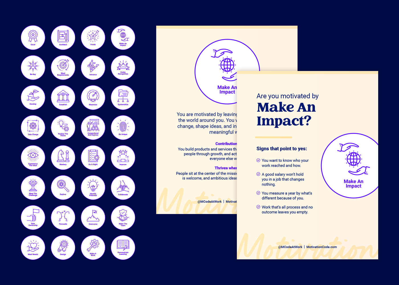
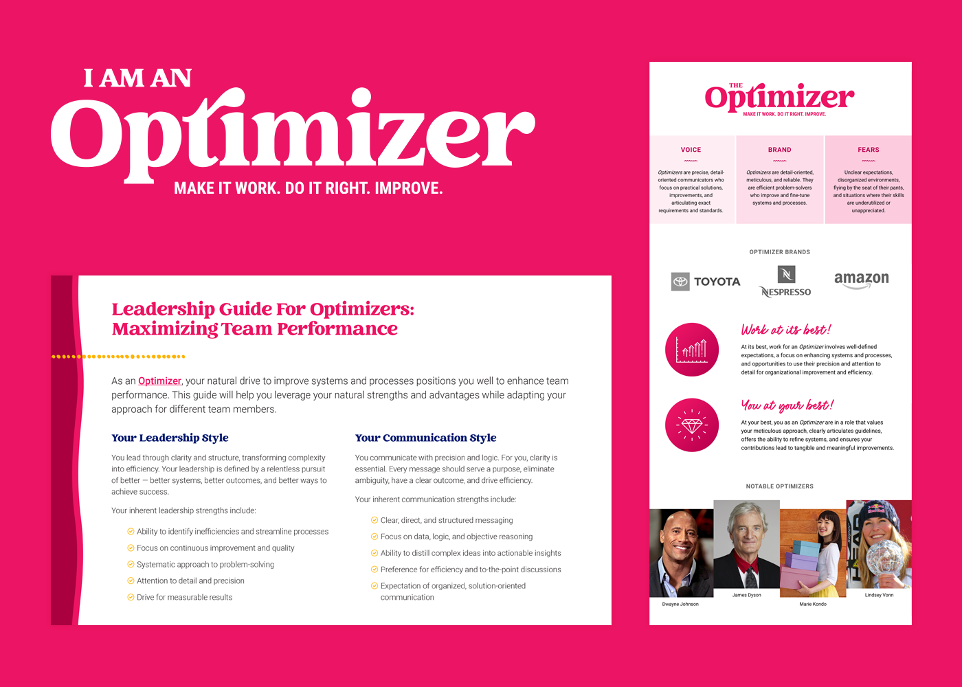
With a framework of 32 Motivations organized into 8 Dimensions, Motivation Code needed an extensive supporting icon system:
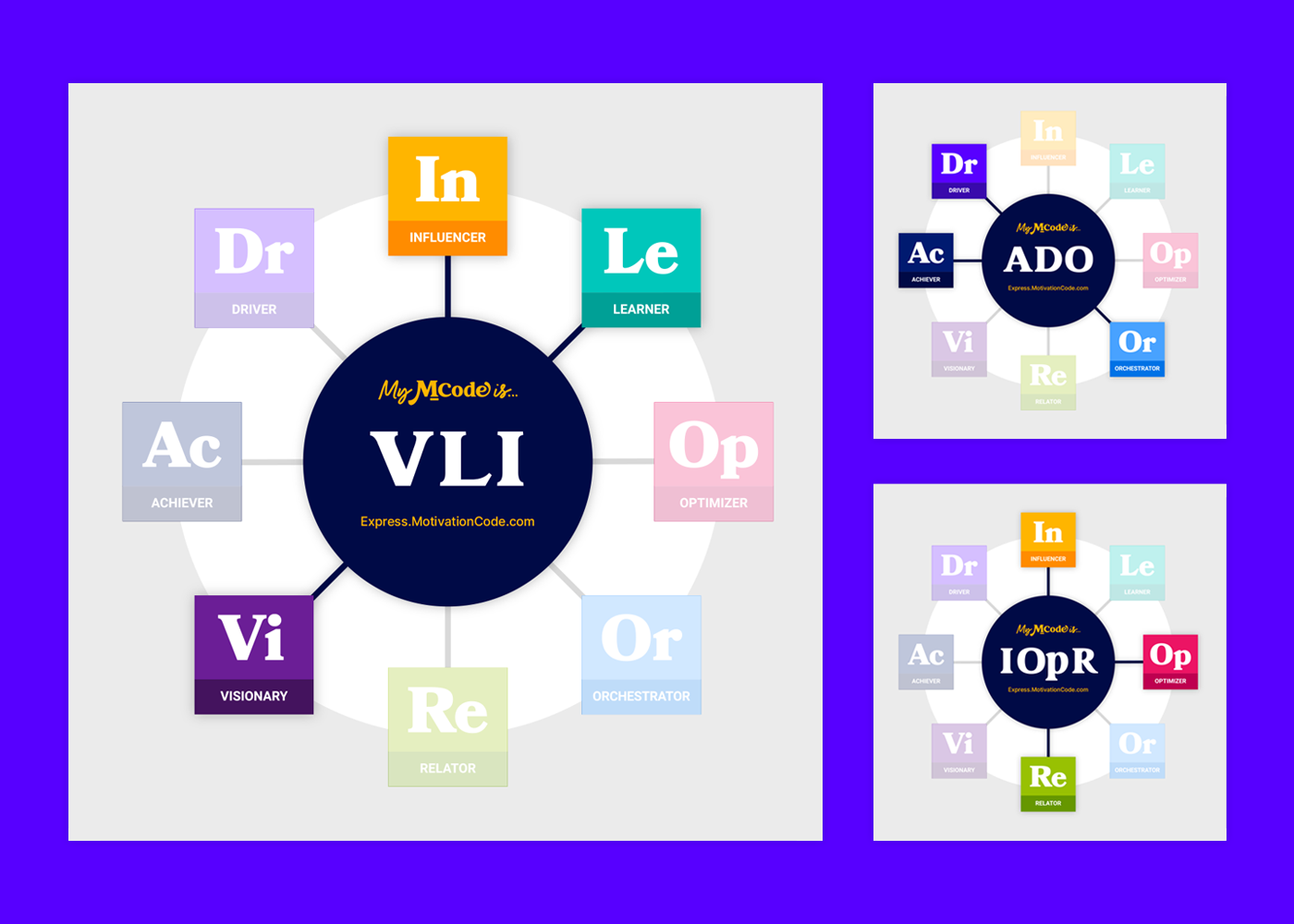
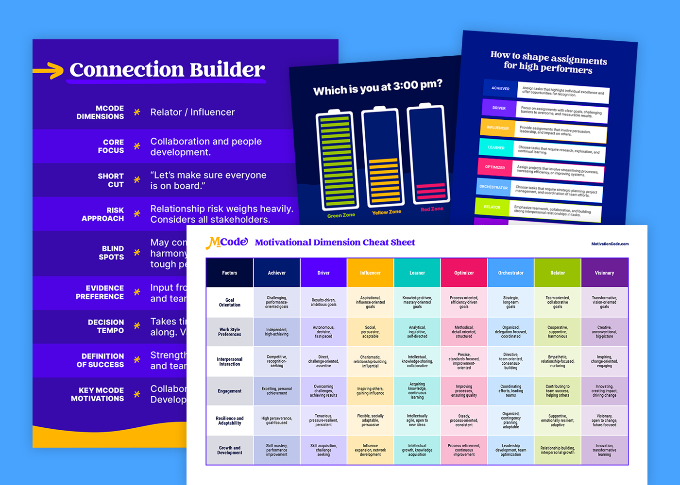
- We established a unique circular icon for each of the 32 Motivations and gave all 8 Dimensions their own typographic wordmark, square icon, and a color it owns.
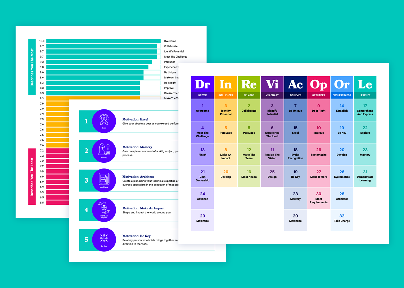
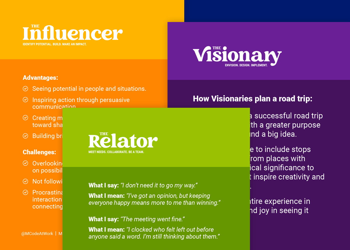
- Achiever = Navy. Driver = Indigo. Influencer = Yellow. Learner = Aqua. Optimizer = Red. Orchestrator = Blue. Relator = Green. Visionary = Purple.
- The Dimension colors became part of the brand’s information architecture and visual storytelling and are now the MCode assessment’s visual signature.
- The brand’s visual style, icons, and Dimension colors were deliberately applied across the assessment product, reports, and SaaS application — and Bourn Creative’s founder had her hand in the assessment report copywriting and the report design.
- To create the brand’s six-session Team Alignment Training, which builds on a team’s assessment results, we collaborated on the copywriting, designed the presentation decks, and created a companion workbook for each session.
Today, customers can identify content themes and relevance to their assessment results by color across the brand’s website, marketing materials, team trainings, social media content, customer education materials, and it’s coach certification and training resources.
Building A Scalable Brand Platform
With the brand defined and applied across its core offer, our attention turned to its platform — its website, email marketing, digital and print marketing and sales enablement materials, and presentation decks.
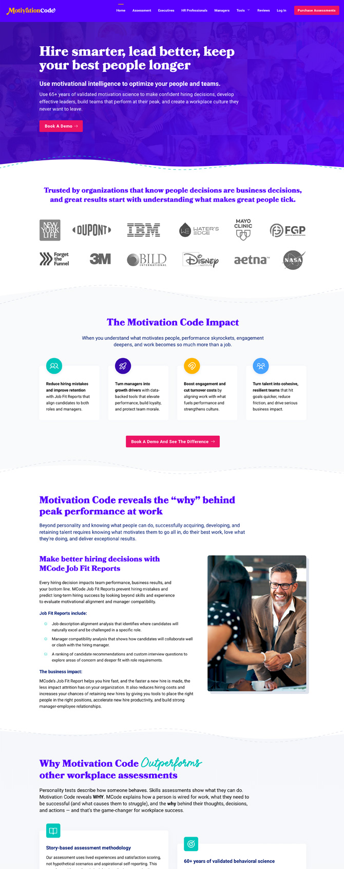
Working closely with Motivation Code’s in-house web developer, we took the brand from no website to a robust website that felt as if it had existed for years — and it started by planning the website strategy and mapping the information architecture, which guided the copywriting, content writing, and our content design for across the site, including new sales and landing pages, blog articles, case studies, and competitor comparison pages.
Built on WordPress, the website design leverages the block editor and custom blocks to provide a collection of patterns that can be combined in any configuration to create flexibility while maintaining consistency and keeping the brand on brand.
Even better? The team is not reliant on one person or an external partner to manage the website. Any member of the team can log in, make updates, upload assets and images, link files, create new pages, and publish articles.
With the website locked in, the brand was then applied across marketing channels:
- We created custom templates in the company’s preferred email marketing software, wrote its post-purchase transactional emails, post-subscribe welcome sequences, its new customer onboarding sequences, and a year-long evergreen nurture sequence.
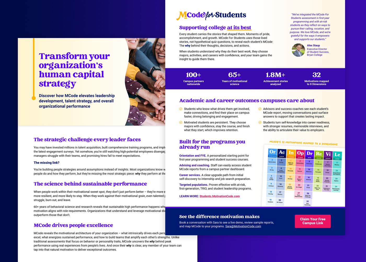
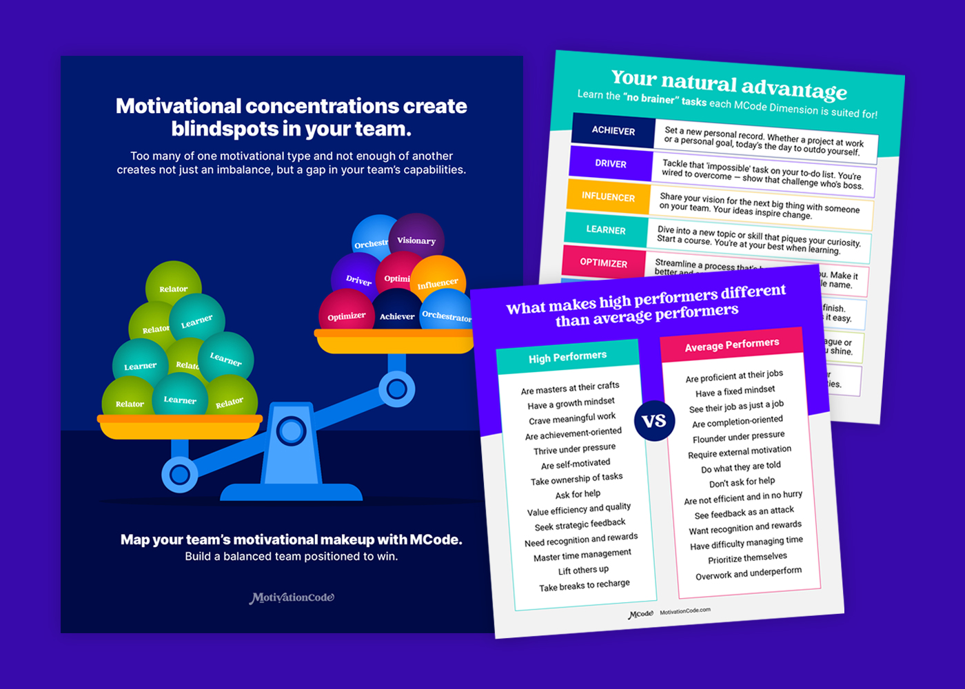
- We wrote and designed product sell sheets, case studies, brochures, and other resources the sales team needed to explain and sell MCode.
- We branded the company’s social media accounts, and when its in-house content writer left, stepped in to own the blog article writing and social media content creation, for Facebook, LinkedIn, Twitter/X, Instagram, YouTube, and Threads, writing captions, designing graphics and carousels, developing video scripts, and recording videos.
- When Motivation Code developed a series of eight free on-demand webinars to build its email list and generate interest in the assessment, we designed the webinar presentations, produced the finished videos, built the opt-in and watch pages, and wrote the follow-up email sequences.
- Motivation Code’s growth strategy included hosting workshops, speaking at conferences, and running its own live events around the country. In support, we created registration pages, presentation decks, name badges, stickers, print leave-behinds, workbooks and worksheets, reference booklets, and supporting marketing materials.
Every asset was created using the company’s preferred software and tools, all native files and final files are organized in a clearly labeled system that anyone in the company can access and use, and all website and marketing content is maintained in Google Docs and downloadable as Markdown files for LLM use.
Creating Guidelines For Staying On Brand
The true test of a brand isn’t how well its creator, designer, or a branding expert can apply it. It’s how well any other person in the company can align their efforts, create on behalf of the brand, and stay on brand.
From day one, the brand system has been stable and flexible.
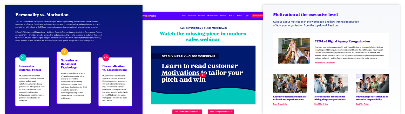
With a goal of providing enough guidance to maintain brand consistency without limiting creativity, guidelines were established for Motivation Code’s voice, personality, communication style, visual brand, and design application. The focus was standardization and clear, simple, easy-to-use documentation that empowers anyone to make good brand decisions.
- Visual brand guidelines:
We created comprehensive guidelines for the use and application of the brand — its logo and brand marks, iconography, color palette, typography, design elements, and imagery — covering everything from approved and prohibited uses to accessibility best practices to the selection of stock photography. - Voice, personality, and communication guidelines:
We defined clear instructions and guardrails for the brand’s personality, voice, and tone, as well as who it speaks to, and how it speaks about its offers, its impact, and its customers in various contexts. We also created detailed rules and restrictions for what is and is not allowed when writing or creating content for the brand. - Design application guidelines:
We defined the guidelines for the brand’s application in content design and visual design, digital and print, to ensure every asset created for the brand remains consistent.
Content guidelines were created in Google Docs to make them easily accessible and editable. They were then turned into AI-ready Markdown files the team could add to their projects. Markdown files were also created for the brand itself, each of the company’s core offers, each ideal customer persona, and its assessment framework.
This collection of assets — created for humans and LLMs — makes sure everyone representing the company is working from the same baseline understanding and brand language.

“We had a vision for our product and the markets we were going to play in but needed help understanding the market and the players. Jennifer pulled together the entire landscape of competition. The brand book she created was like something I’d expect from a Fortune 100 enterprise. What would have taken a team of people 12 weeks was done in a quarter of that time. Our brand and the rebrand of our central product was done in about three weeks.
Jennifer brought design thinking, brand architecture, language, and visual design to every marketing conversation and every product, channel, partner, and coaching conversation we had as a team.
She built engagement engines on our website that resulted in thousands of leads being generated, and automated our social media to publish content regularly, reinforcing the idea that we weren’t a young startup, but one that had been around for years.”
Chris Lema, CEO, Motivation Code
Establishing A Unified Brand Architecture
Eventually, the decision was made to make Motivation Code the customer-facing brand, not Motivations AI. Motivation Code became the primary brand, with two endorsed brands under its umbrella.
The original company structure centered Motivations AI as the parent brand for multiple assessment brands and product lines, all powered by the same Motivation Code framework and motivation-based assessment:
- Motivation Code focused on the corporate vertical.
- TruMotivate focused on the college student vertical.
- TruCenter focused on the ministry and church vertical.
The initial goal was to level up the brands without erasing what existing customers were familiar with. That meant retaining the TruMotivate and TruCenter identities, slowly bringing them into alignment with the Motivation Code brand, and eventually rebranding.
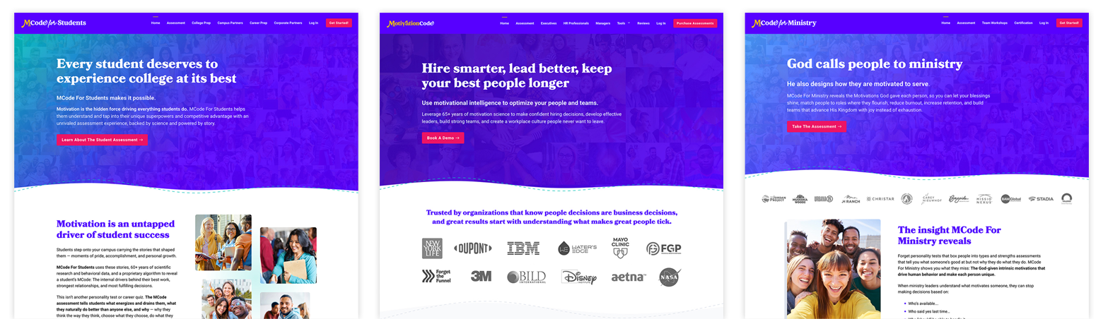
- Years 1-2: Striking a balance between the existing identities and the brands’ futures, TruMotivate and TruCenter received new WordPress websites with new copy, a new design, and a flexible content management system. We created marketing materials and tradeshow booth backdrops and banners, and designed a published guidebook for college students.
- Years 3–4: TruMotivate rebranded to MCode For Students: College at its best, and TruCenter rebranded to MCode for Ministry: Ministry at its best. Rebranding included new logos, new website copy and websites, new marketing materials, and the brand transition communication plan for partners and customers.
Creating a unified brand architecture has strengthened brand awareness, credibility, and visual recognition, while also developing brand equity and creating cross-vertical pipeline opportunities that never existed before.

“It has been a privilege to have Jennifer Bourn as our Chief Brand Officer. Jennifer rebranded our entire MCode offering — the product, the website, and every piece of communication — and did it with unparalleled creativity and speed. If you’re a business owner or marketing director bringing a new brand to life or ready for a serious refresh, Jen is the rare partner who works independently, moves fast, and delivers exactly what she promises. I look forward to working with her again!”
Rod Penner, MCode Co-Founder
Becoming A Known Brand
For a young company, looking credible was only part of the job. Motivation Code needed more of the right people to know it existed. It needed to build familiarity, trust, and credibility.
We worked across content, demand generation, email, search, social media, and inbound and outbound brand marketing to expand brand reach and gain visibility with the right people.
As the primary platform MCode’s ideal customers are already active on, LinkedIn is the priority for outbound efforts. With company pages having limited organic reach and personal profiles having better content distribution and direct access to specific people, our LinkedIn brand expansion strategy focused on:
- Company page content:
Publishing education and authority content to the Motivation Code company page — text, document/carousel, graphic, and video posts — on a consistent cadence to not just increase visibility and reach but also provide more opportunities for partners and MCode Certified Coaches to share branded content. - An evergreen content library:
Developing a collection of 140+ social media posts supporting the brand’s core messaging and list-building and revenue-generating offers, making it easy and fast for any team member to post about the brand, whether they simply copy-and-paste or make it their own. - Personal 1:1 outreach:
Using a scalable agentic go-to-market strategy that first connected team members with targeted prospects relevant to their backgrounds and areas of expertise, then automated personalized direct message campaigns. The initiative grew their LinkedIn networks, created interest, increased website traffic, started conversations, and generated leads.
Owning The Role Of Brand Champion
We created an extraordinary brand alongside an incredible team advancing a product line designed to help people better understand themselves, articulate what makes them great, contribute more of their value, and experience their work and lives at their best.
Regardless of the application, the original brand system has held strong. It can move from software screens to a conference booth, from an assessment report to an Instagram carousel or reel, from a sales brochure to a six-session training program, from an email to an event presentation, from a sticker to a workbook, from a website to a series of books and still feel unmistakably Motivation Code.
Every effort has stayed on brand because the brand was built with enough flexibility to support a growing company with new products, audiences, ideas, channels, and opportunities.
Motivation Code’s branding story demonstrates what’s possible when branding experts like Bourn Creative work deeply inside a business — like a fractional Chief Brand Officer or fractional Chief Marketing Officer — instead of bouncing in and out for disconnected projects.
- We learn your brand — it’s vision, vibe, voice, and visuals — until we know it like the backs of our hands.
- We connect strategy, copy, design, marketing, product, content, and sales instead of treating them as separate swim lanes and creative assignments.
- We protect your brand equity and stay consistent and on brand while moving quickly.
And when the next idea, opportunity, launch, event, campaign, product, or problem appears, the MCode team doesn’t have to stop and figure out who can handle it because they already have a partner who has their back and understands their brand!
Sounds Awesome, Right?!
If your brand is ready for an all-in creative partnership like this, we’d love to talk about your brand! Or, if you want to learn a bit more first, check out our branding and brand marketing services or learn more about what its like to be a client.
Let's Make Your Brand Extraordinary!
Every brand we champion is unique, which means how we work together, the strategy we execute, and what we produce is also unique. Ready to learn more and see what's possible for your brand?